Digital Ohana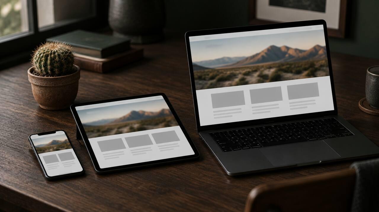
Think about the last time you looked up a local business. Chances are you were on your phone, maybe in the car, maybe between other things, and you wanted an answer fast: are they open, what do they charge, can I call them right now?
Your customers are doing the same thing. That's why we design every site phones first. "Responsive design" means a site that adjusts to any screen size. Phones-first goes a step further: we start with the small screen, because that's where the decisions get made, and then make it work beautifully on larger screens too.
Here's what that looks like in practice for a local business.
Tap-to-call that's always within reach
For many local businesses, a phone call is the most valuable thing a website can produce. So the phone number shouldn't be hidden in the footer or shown as plain text someone has to copy.
On a phones-first site:
- The phone number is a real tap-to-call link, so one tap starts the call.
- It's easy to reach on every page, not just the contact page.
- The button is big enough to hit with a thumb, without accidentally tapping something else.
It sounds simple, but a lot of older sites still get this wrong.
Short forms that are easy to fill out
Some people would rather not call, especially after hours. A quote or booking form gives them another way in. But typing on a phone is a chore, so every extra field costs you leads.
We keep forms short and ask only for what you need to follow up: usually a name, a way to reach them and a quick note. We also use the right field types, so the phone keypad pops up for a phone number and the email keyboard pops up for an email. Little details like that make a form feel easy instead of annoying.
Every site we build has a quote or booking form on every page, so a customer never has to hunt for it.
Text you can read without squinting
If someone has to pinch and zoom to read your services, many of them won't bother. Phones-first design means:
- Text that's comfortably large on a small screen.
- Short paragraphs and clear headings, so people can skim.
- Strong contrast between text and background, which also matters outdoors in bright sun, something we think about a lot in Las Vegas and Hawaii.
- Buttons and links spaced far enough apart to tap accurately.
Never disable zoom
Some sites block people from zooming in on their phones. It's usually done to stop the layout from shifting, but it hurts anyone who needs larger text, including many older customers and people with low vision.
We never disable zoom. If the design is right, people won't need to zoom. If they want to anyway, they should be able to.
Speed is part of mobile design
A page can look perfect on a phone and still fail if it takes too long to load on a cell connection. Large images, heavy animations and stacks of plugins all slow things down.
Our sites are custom-coded, so they only load what each page actually needs. Images are sized for the screen they're shown on. The result is a site that feels quick, even on a weaker signal. We go deeper on this in our post on why website speed matters.
Layouts that make sense on a small screen
A desktop layout squeezed onto a phone is not the same as a phone layout. On a small screen, the order of things matters a lot. We put the most important information first:
- What you do and where you do it.
- How to contact you.
- Why people should choose you, like reviews, photos and experience.
- The details, like services, pricing and FAQs.
Menus are simple and easy to open with one thumb. Nothing important hides behind tiny icons.
Then we make it great on desktop too
Phones first doesn't mean phones only. Plenty of people still compare options on a laptop, especially for bigger jobs. Once the phone version is solid, we expand the design for tablets and desktops so it uses the extra space well.
How does your site look on a phone?
Pull up your website on your own phone right now. Can you call with one tap? Can you read everything without zooming? Is the form quick to fill out? Does it load fast?
If any of those answers is "not really," we'd be glad to help. Request a free site audit and we'll send a plain-English list of what's costing you calls and what to fix first. You can also see what's included on our pricing page.